
Bridget RILEY (1931)
Series 41. Two Colour Twist, Yellow and Violet. Three Colour Twist, Red, Green and Blue, 1979
Gouache on paper
96,5 x 62 cm | 37 15/16 x 24 3/8 inches
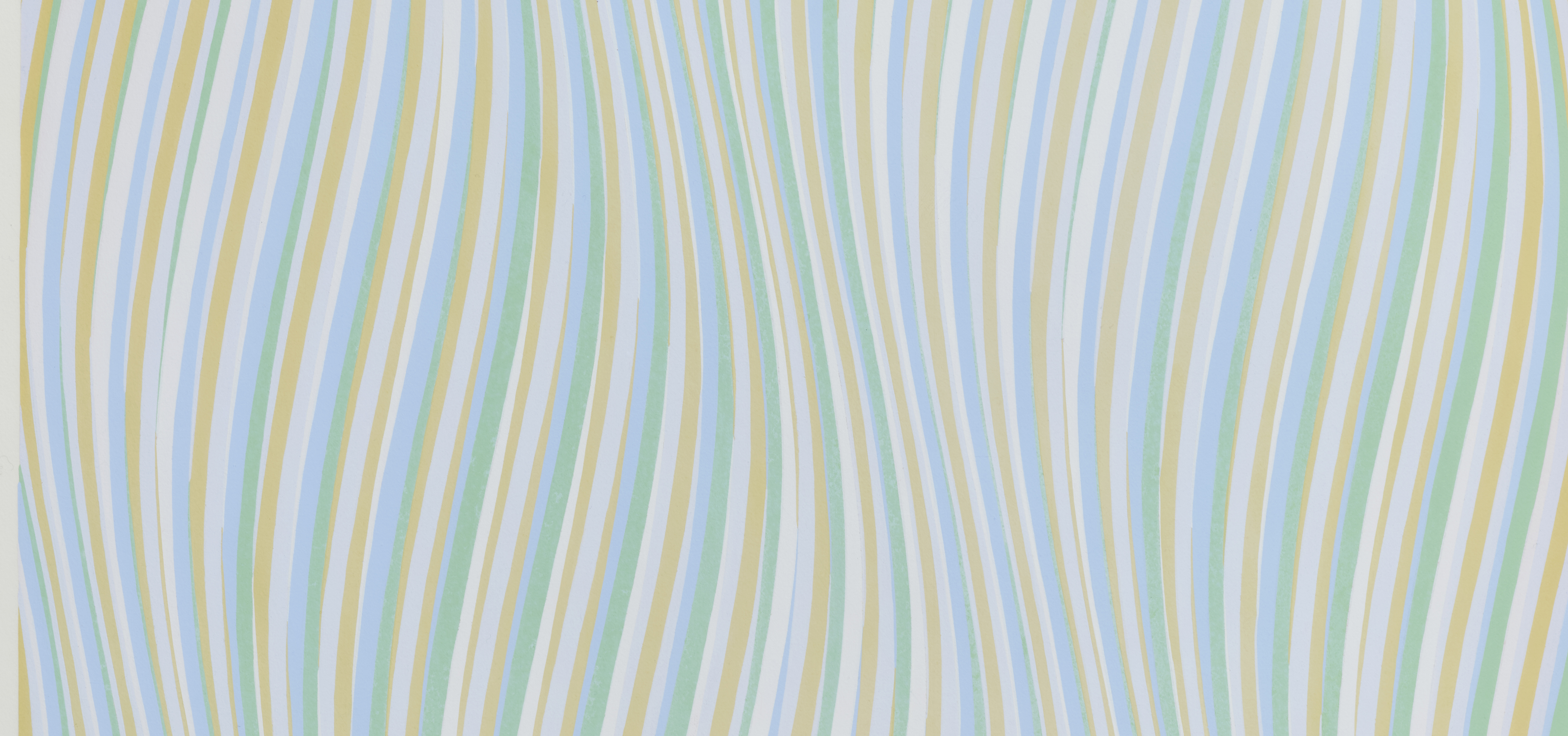
Series 41. Two-Color Twist, Yellow and Violet. Three-Color Twist, Red, Green, and Blue (1979) perfectly illustrates Bridget Riley’s thoughtful approach to color, perception, and structure. Created at a time when she had fully integrated the lessons of art history into her own visual language, this work demonstrates both scientific rigor and sensory richness. Riley seeks to make painting a field of dynamic visual experience, where the gaze itself becomes the subject.
This work dates from 1979, a period when Riley had definitively moved away from her early black-and-white paintings of the 1960s to embark on an in-depth exploration of color. Her earlier works, associated with the emergence of Op Art and major exhibitions such as The Responsive Eye, were based on striking optical contrasts and retinal disturbances produced by monochromatic geometries.
This perceptual logic is essential to understanding Riley’s evolution. Her transition from black-and-white to color was not a break with the past, but rather a deepening of the optical phenomena she had already explored. Her in-depth study of Seurat was decisive. Her study of Le Pont de Courbevoie in 1959 enabled her to assimilate the principles of Divisionism and “chromo-luminarism,” a concept favored by Seurat himself. This principle is fully at work here: complementary contrasts intensify the visual vibrations, while more complex combinations enrich the perceptual rhythm.
This gouache on paper is part of a series in which Riley explores the dynamic interplay of colors through sinuous, rhythmic bands. The composition is based on chromatic alternations (yellow/purple and red/green/blue) arranged in a twisted structure. The work is built on this tension between order and perceptual instability. The structure is rigorously constructed, yet this stability is constantly disrupted by the eye’s response. The motif of torsion plays a central role here. It introduces a more complex dynamic, guiding the viewer’s gaze in a sinuous movement that suggests expansion, contraction, and depth.
Gouache allows for intense, matte solid colors with great precision. While each band is clearly defined, the overall effect creates an impression of unstable movement, like a continuous undulation. Up close, the colors remain distinct; from a distance, they blend optically, producing secondary hues and luminous vibrations.
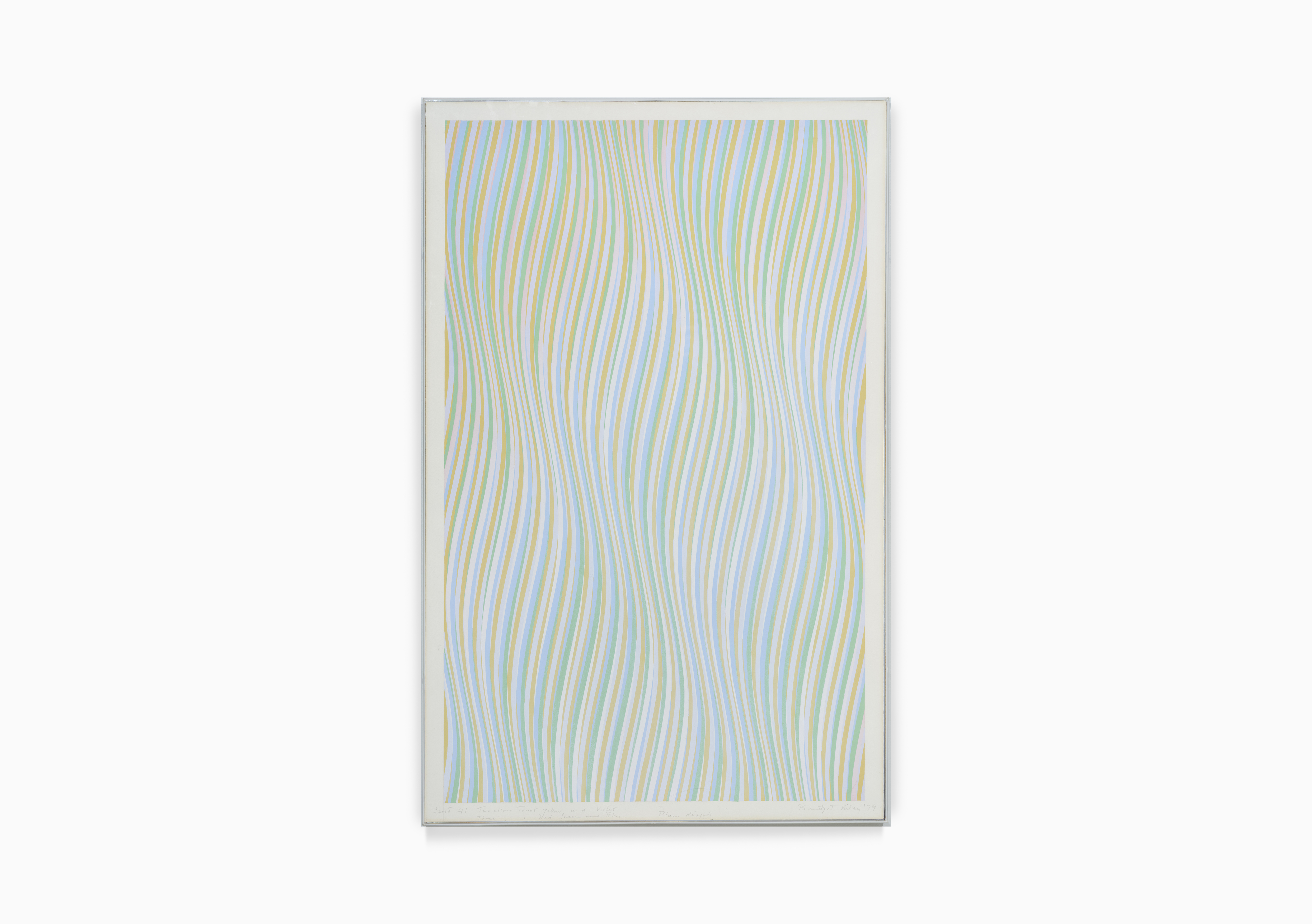
Series 41. Two Colour Twist, Yellow and Violet. Three Colour Twist, Red, Green and Blue, 1979
Gouache on paper
96,5 x 62 cm | 37 15/16 x 24 3/8 inches
Bridget Riley
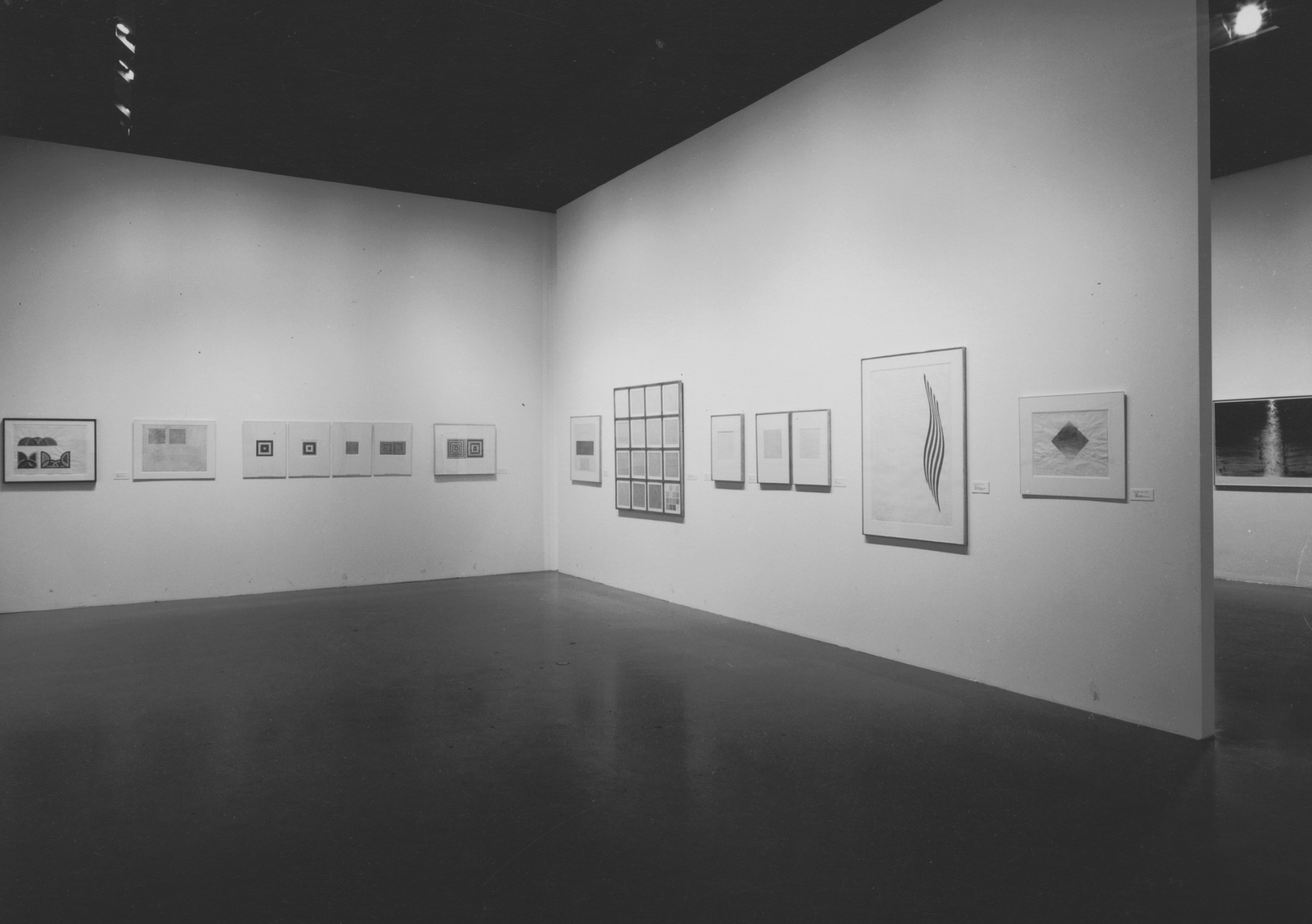
The Maximal Sixties: Pop, Op and Figuration, 1997, MoMA New York
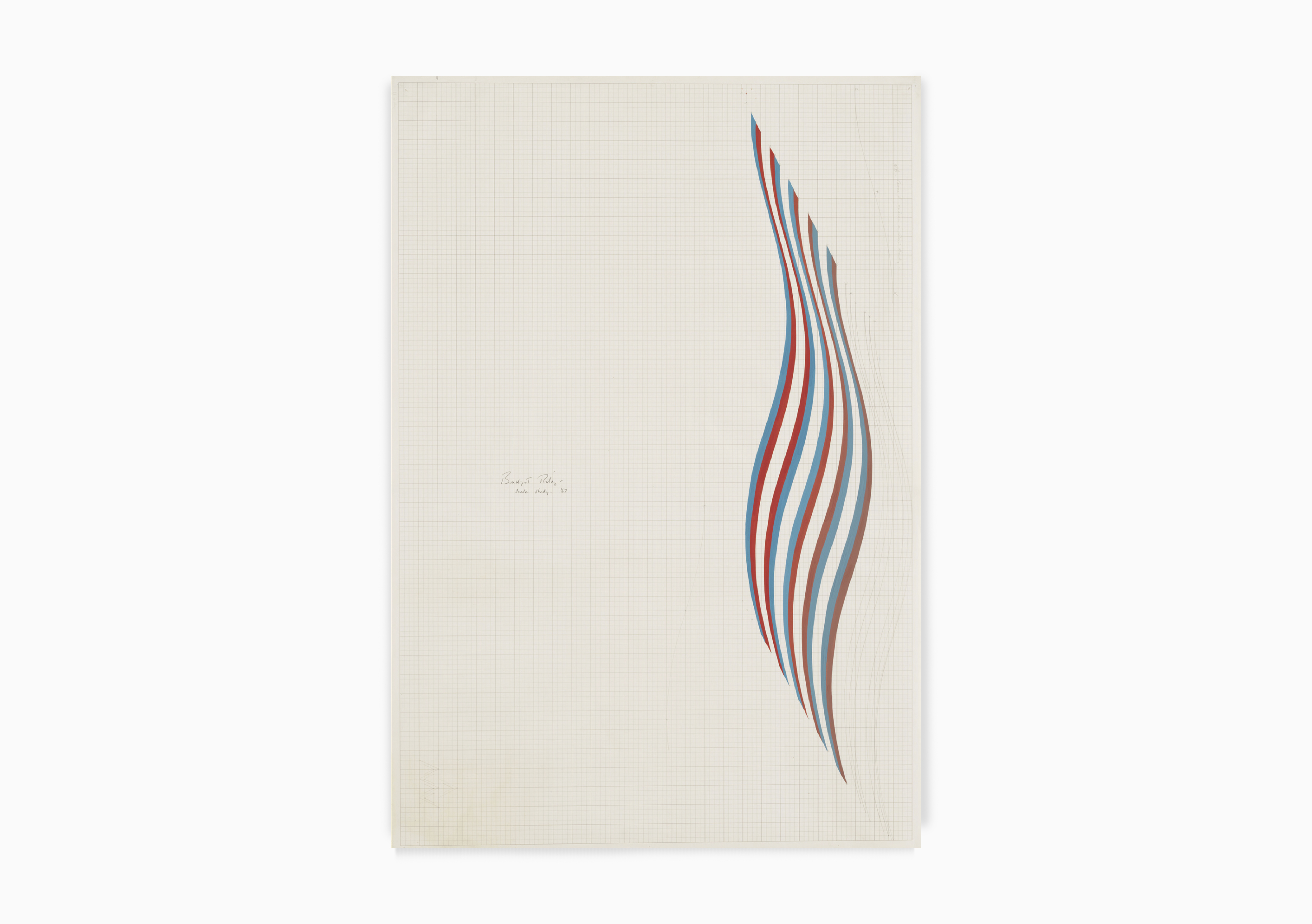
Bridget Riley, Scale study for Cataract Series, 1967.
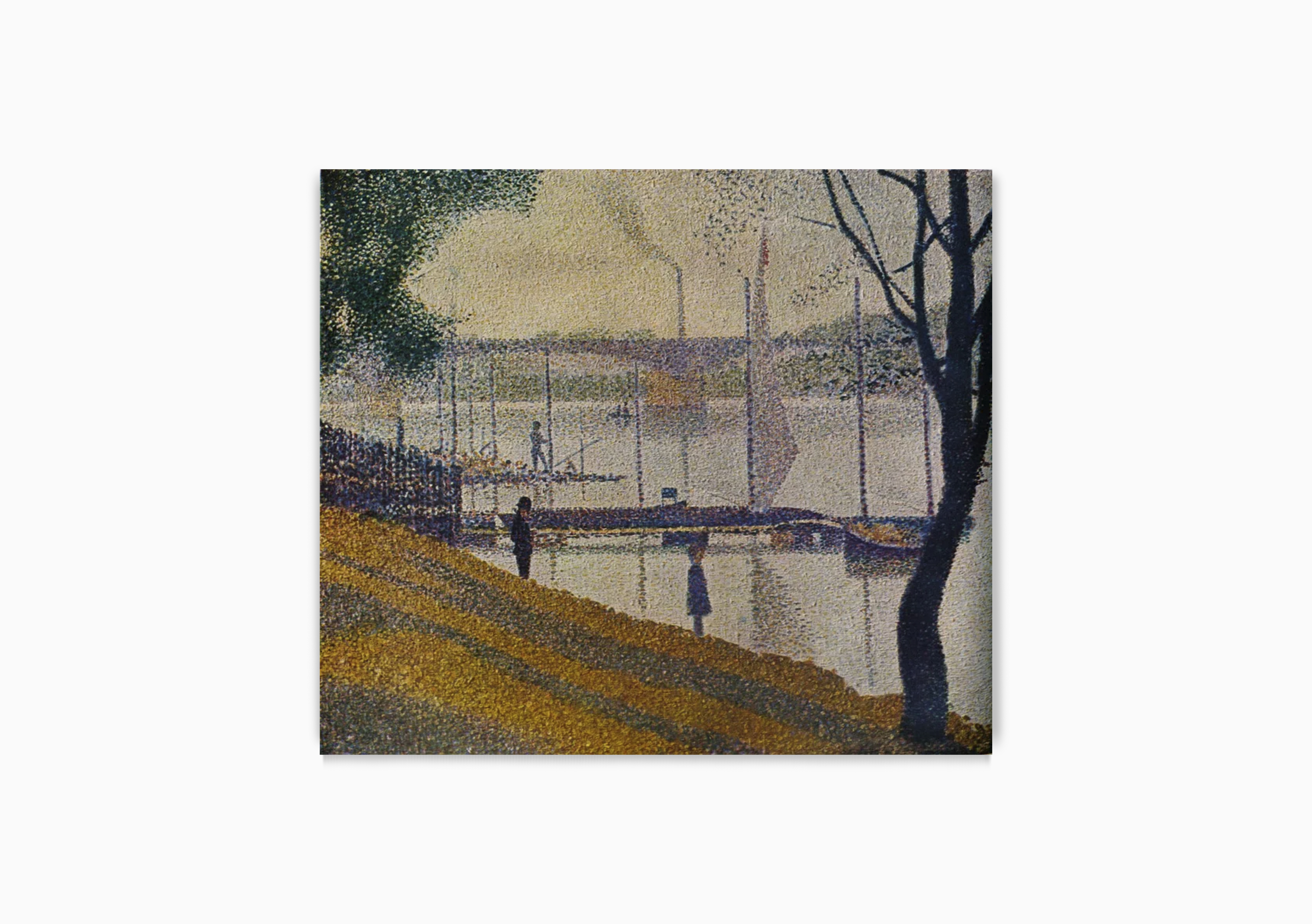
Georges Seurat, Le Pont de Courbevoie, 1886-87. ©Musée d'Orsay
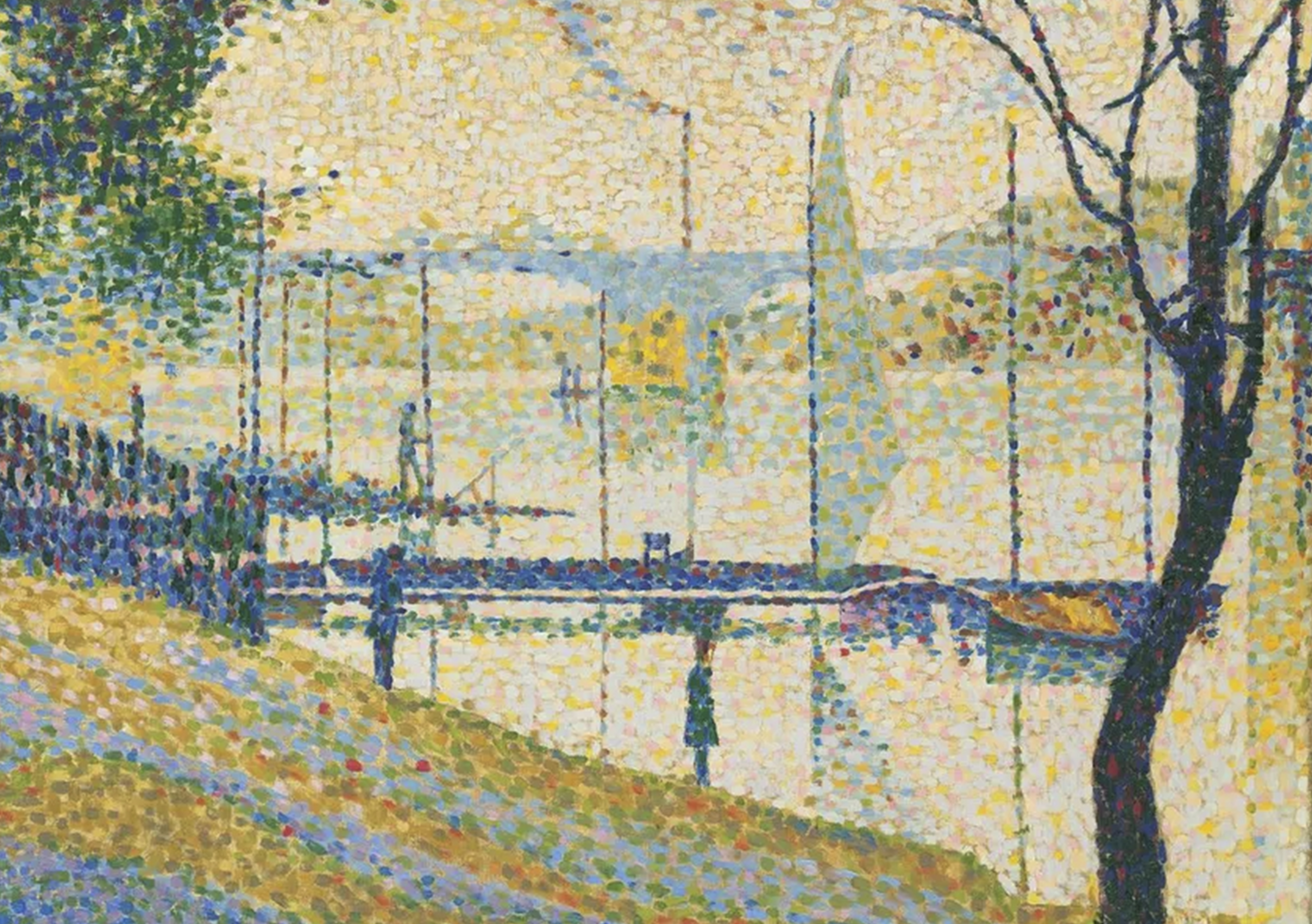
Bridget Riley, Le Pont de Courbevoie by Seurat, 1959 ©Bridget Riley
Bridget Riley in conversation with Eric de Chassey on the occasion of the exhibition Bridget Riley: A Starting Point at the Musée d’Orsay, October 21, 2025 – January 25, 2026
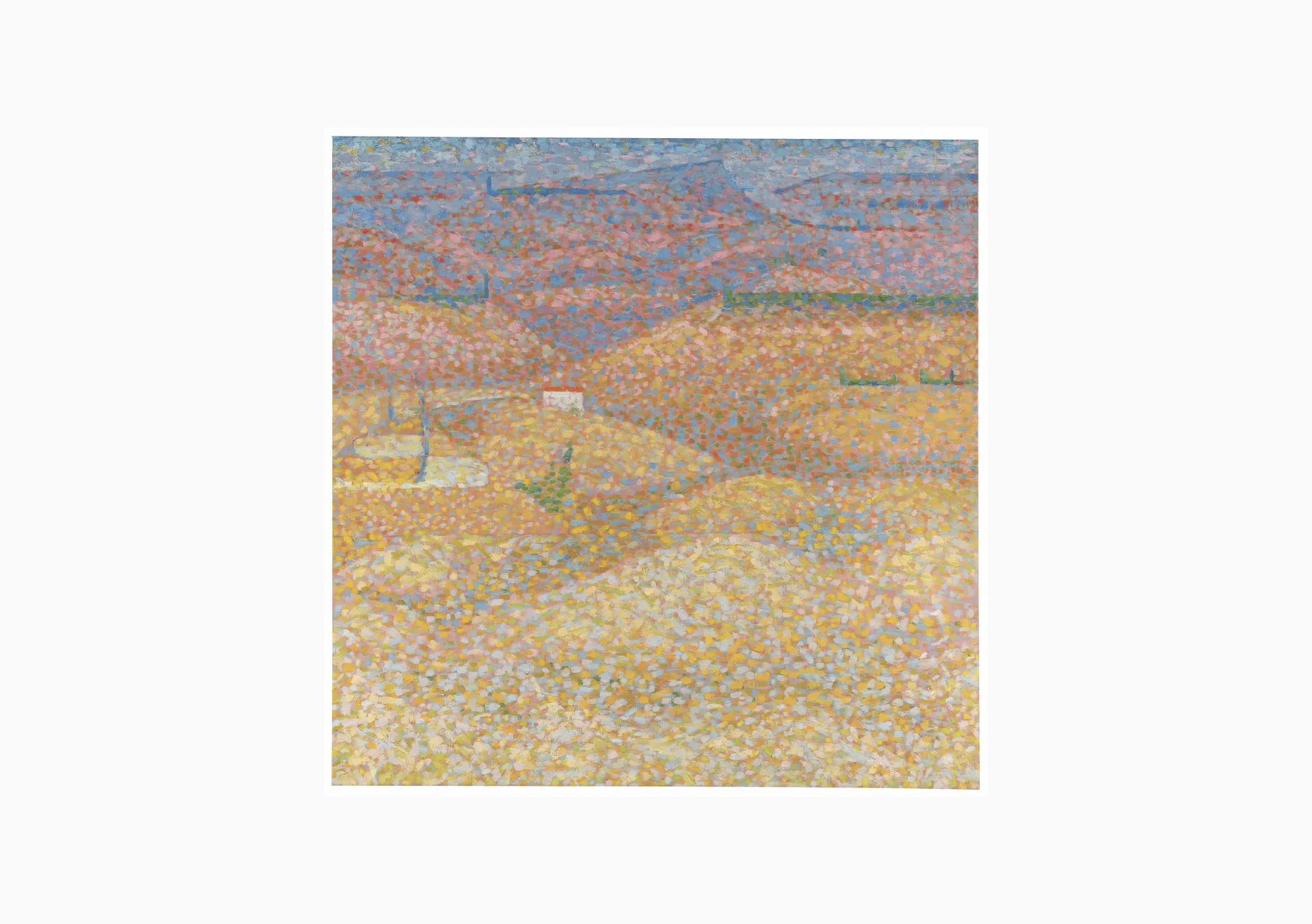
Bridget Riley, Pink Landscape, 1960. ©Bridget Riley
Bridget Riley, Series 41. Two Color Twist, Yellow and Violet. Three Colour Twist, Red, Green and Blue. (detail)